Conversion-Focused Website Design for Business Growth

sadiya
July 4, 2026
Table of Contents
- What is Conversion-Focused Website Design?
- Conversion-Focused Website Design vs Beautiful Website Design
- Top Signs You Need Conversion-Focused Website Design
- Root Causes: Why Good-Looking Websites Still Fail
- How to Get Started
- Solutions and Strategies
- Actionable Framework: Website Conversion Design Checklist
- The Hidden Impact
- Common Mistakes to Avoid
- Frequently Asked Questions
- Conclusion and Next Steps
A beautiful website can still fail. It can have smooth animations, modern colors, expensive visuals, and a clean layout but still bring in very few leads, calls, bookings, or sales. That usually happens because the website was designed to impress, not to guide people toward action.
For most businesses, the website is not just a digital brochure. It is often the first place customers judge your credibility, compare your offer, understand your value, and decide whether to contact you.
That is why conversion-focused website design matters. HubSpot’s 2026 marketing statistics show that website, blog, and SEO remain the number one ROI-generating channel for marketers, which means your website should be treated as a business growth asset, not just a visual project.
The target audience for this article includes small business owners, startups, service businesses, e-commerce brands, consultants, agencies, B2B companies, local businesses, and marketing teams that want their website to generate measurable results.
What is Conversion-Focused Website Design? #
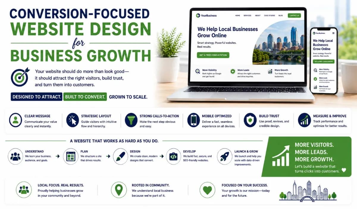
Conversion-focused website design is the process of designing a website around a clear business goal, user journey, persuasive messaging, fast performance, strong calls-to-action, and measurable actions such as leads, sales, bookings, signups, or inquiries.
It is not anti-design. It simply means design should support the customer journey. A conversion-focused website answers the questions visitors are already asking:
What does this business offer?
Is this relevant to me?
Can I trust them?
What makes them different?
What should I do next?
Good conversion centered design removes friction. It makes the next step obvious without making the visitor work too hard.
Google’s Core Web Vitals measure real-world user experience across loading performance, interactivity, and visual stability, and Google recommends strong Core Web Vitals for Search success and user experience.
Conversion-Focused Website Design vs Beautiful Website Design #
A website should look good, but looks alone do not pay the bills.

The best websites combine both. They look professional and help visitors take action.
Top Signs You Need Conversion-Focused Website Design #
You may need conversion-focused website design if your website gets traffic but does not generate enough business. Common signs include:
Visitors are not filling out forms
People leave your homepage quickly
Your CTAs are unclear or hidden
Your website looks nice but feels vague
Your mobile experience is weak
Your pages load slowly
Your service pages do not explain outcomes
Your website has no analytics tracking
Your paid ads are not converting
Your competitors explain their value better
Speed alone can affect behavior. Google’s mobile research found that bounce rates rise as load time increases, with average bounce rates increasing from 13% under three seconds to nearly 60% after nine seconds.
If your website is slow, unclear, or hard to use, people may leave before they ever understand your offer.
Root Causes: Why Good-Looking Websites Still Fail #
Most websites fail because they are built around the wrong question. The wrong question is: “How can we make this look impressive?” The better question is: “How can this website help the right customer move forward?” A website that sells usually has:
A clear offer
Customer-focused messaging
Simple navigation
Fast loading pages
Strong mobile usability
Clear calls-to-action
Trust signals
SEO-friendly page structure
Analytics and conversion tracking
Proof, process, or examples
For e-commerce businesses, friction is especially costly. Baymard’s checkout usability research says the average large-scale e-commerce site can potentially improve conversion rate by 35% through better checkout UX.
That same principle applies to service websites. When the experience is easier, clearer, and more trustworthy, more visitors take action.
Warning: A website that looks good but has weak copy, slow pages, confusing navigation, and no clear CTA will still lose customers.
How to Get Started #
Before redesigning your website, diagnose where conversions are leaking.
Define the main conversion goal
Decide whether the website should drive calls, form submissions, bookings, purchases, demos, signups, downloads, or quote requests.Review the homepage first screen
Check whether visitors can understand your offer, audience, value, and next step within a few seconds.Audit your calls-to-action
Look at every main page and check whether the CTA is clear, visible, and relevant to the user’s stage.Test the mobile experience
Open your website on a phone and check buttons, forms, spacing, loading speed, navigation, and readability.Check page speed and Core Web Vitals
Use Google PageSpeed Insights, Search Console, or Lighthouse to review performance and usability issues.Review content clarity
Replace vague company-focused copy with customer-focused messaging that explains problems, outcomes, and next steps.Set up conversion tracking
Track forms, calls, button clicks, purchases, bookings, and key page visits so you know what is working.Compare with competitors
Study how competitors structure their homepages, service pages, CTAs, proof sections, and conversion paths.
Solutions and Strategies #
Foundational Strategy #
Start with the basics that directly affect user decisions. Your website should include:
Clear headline
Specific value proposition
Simple navigation
Fast-loading pages
Mobile-first layout
Customer-focused copy
Visible CTA buttons
Trust signals
Service or product clarity
Contact or booking flow
Basic SEO structure
A good homepage should quickly tell users what you do, who you help, why it matters, and what to do next.
Tools Strategy #
Use tools to find friction before guessing. Helpful tools include:
Google Analytics 4 for traffic and conversion tracking
Google Search Console for SEO and Core Web Vitals
Microsoft Clarity for heatmaps and session recordings
PageSpeed Insights for performance checks
Lighthouse for technical audits
Hotjar for user behavior insights
Screaming Frog for SEO structure checks
A/B testing tools for testing page variations
CRM tracking for lead quality measurement
Google Search Console’s Core Web Vitals report uses real-world usage data to show how pages perform and helps site owners identify poor user experiences.
That matters because what looks fine to your internal team may still feel slow or confusing to real users.
Professional Strategy #
Professional conversion-focused website design should connect strategy, design, copy, SEO, UX, development, analytics, and testing. A strong process usually includes:
Audience research
Competitor review
Website audit
Conversion goal mapping
UX wireframes
Conversion-driven copywriting
Mobile-first design
SEO structure
Speed optimization
Analytics setup
Launch testing
Post-launch improvement
This is where conversion focused website design examples become useful. Do not copy another website directly. Use examples to study how strong pages structure their headlines, proof, CTAs, pricing, FAQs, forms, and trust signals.
Actionable Framework: Website Conversion Design Checklist #
Use this checklist before launching or redesigning a business website.

The Hidden Impact #
A weak website does not only reduce conversions. It quietly affects how people judge your business. If the website is confusing, visitors may assume the business is disorganized. If the site is slow, they may assume the service will be slow too. If the copy is vague, they may choose a competitor that explains the value better.
There is also a marketing cost. Paid ads become more expensive when traffic lands on weak pages. SEO efforts underperform when pages are poorly structured.
A conversion-focused website gives every channel a better destination. Social media, SEO, ads, referrals, email, and sales outreach all work better when the website can turn attention into action.
Common Mistakes to Avoid #
Avoid these mistakes when planning your website:
Designing only for aesthetics
Using vague headlines
Hiding the CTA
Making forms too long
Ignoring mobile users
Using slow, heavy visuals
Writing company-first copy
Skipping SEO basics
Not showing proof
Adding too many menu items
Sending ad traffic to generic pages
Launching without analytics
The biggest mistake is thinking your website is finished once it goes live. A strong website should be measured, tested, and improved over time.
Frequently Asked Questions #
What is conversion-focused website design? #
Conversion-focused website design means building a website around user actions such as leads, sales, calls, bookings, or signups. It combines clear messaging, smart layout, strong CTAs, fast performance, trust signals, and analytics.
Why does every business need a website that sells? #
A website that sells helps turn visitors into real business opportunities. A good-looking website may create a first impression, but a conversion-focused website supports revenue, lead generation, and customer trust.
What are good conversion focused website design examples? #
Good conversion focused website design examples usually include a clear headline, strong CTA, customer-focused copy, trust signals, fast mobile experience, and simple navigation. The best examples make the next step obvious without overwhelming the visitor.
What is conversion centered design? #
Conversion centered design is a design approach focused on guiding users toward a specific action. It uses visual hierarchy, persuasive copy, clarity, trust, and reduced friction to improve conversion rates.
How do I know if my website is not converting? #
Check your traffic, form submissions, calls, bookings, bounce rate, page engagement, and conversion rate. If traffic is coming in but very few users take action, the issue may be your messaging, UX, CTA, speed, or offer clarity.
Can SEO and conversion design work together? #
Yes, they should work together. SEO brings qualified visitors to your website, while conversion-focused design helps those visitors understand your value and take the next step.
Should I redesign my website or just improve key pages? #
Start with your highest-impact pages: homepage, service pages, product pages, landing pages, and contact page. If the full website has weak structure, slow performance, and inconsistent messaging, a full redesign may be the better move.
Conclusion and Next Steps #
A website should not just look good. It should help your business grow.
Key takeaways:
Conversion-focused website design turns design into a sales and lead-generation tool.
A strong website needs clear messaging, fast performance, simple navigation, and visible CTAs.
Conversion centered design removes friction and guides users toward action.
Good design should support SEO, UX, trust, and measurable conversions.
Analytics and testing help improve the website after launch.
Start by reviewing your homepage, CTAs, page speed, mobile experience, service pages, and analytics setup. Then fix the gaps that stop visitors from becoming leads or customers.
At Vynce Digital, we help businesses build websites that do more than look modern. We create websites designed around strategy, SEO, performance, user experience, and conversion.
Your website should not just sit online. It should explain your value clearly, earn trust quickly, and help the right customer take the next step.