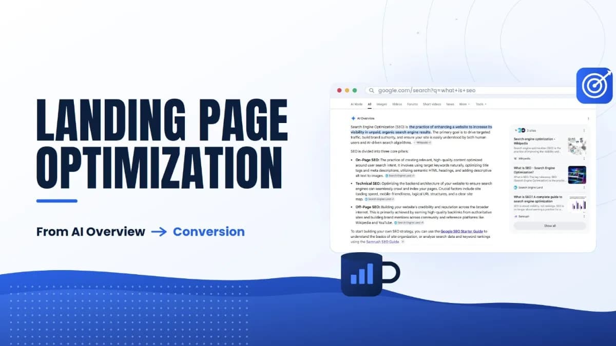
Landing Page Optimization: From AI Overview to Conversion
SEO Specialist · July 20, 2026
Table of Contents
- Turning AI Overview Traffic Into Conversions
- The Visit You Get Now is a Different Visit
- Match The Promise That Brought Them
- Write For The Skim, Not The Read
- Speed is The First Thing They Feel
- The Anatomy of a Page Built to Convert
- Forms Are Where Intent Meets Friction
- Proof Does The Convincing
- Know What Good Looks Like, Then Test Toward it
- The Agentic Shift is Already Moving The Finish Line
- What To Do With All This
- Frequently Asked Questions
Turning AI Overview Traffic Into Conversions #
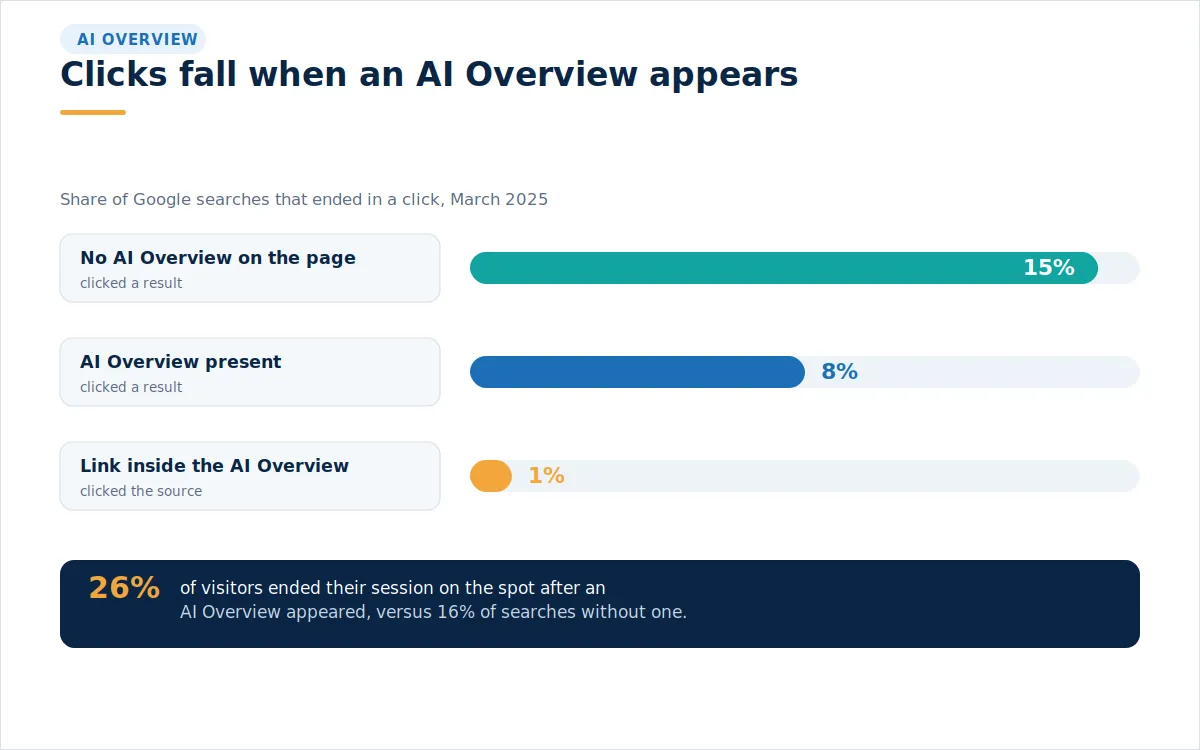
The search results page does not look the way it did two years ago. For a growing share of questions, Google now answers first, in its own words, at the top of the page. People read the summary, and many of them stop there. Pew Research Center tracked the browsing of 900 adults across nearly 69,000 searches in March 2025 and found that when an AI Overview appeared, people clicked a traditional result only 8 percent of the time, against 15 percent when no summary was present. Clicks on the sources within the summary were even rarer, at 1 percent.
That reads like bad news, and for raw traffic it is. One December 2025 analysis of 300,000 keywords found that the drop in clicks to the top organic result was 58 percent once an AI Overview sat on the page. But the number that decides revenue is not how many people arrive. It is how many of them do the thing you built the page to make easy. The visitor who still clicks through after the summary has already covered the quick facts tends to be further along and closer to a decision. Landing page optimization is about meeting that visitor and giving them a clear reason to act.
The Visit You Get Now is a Different Visit #
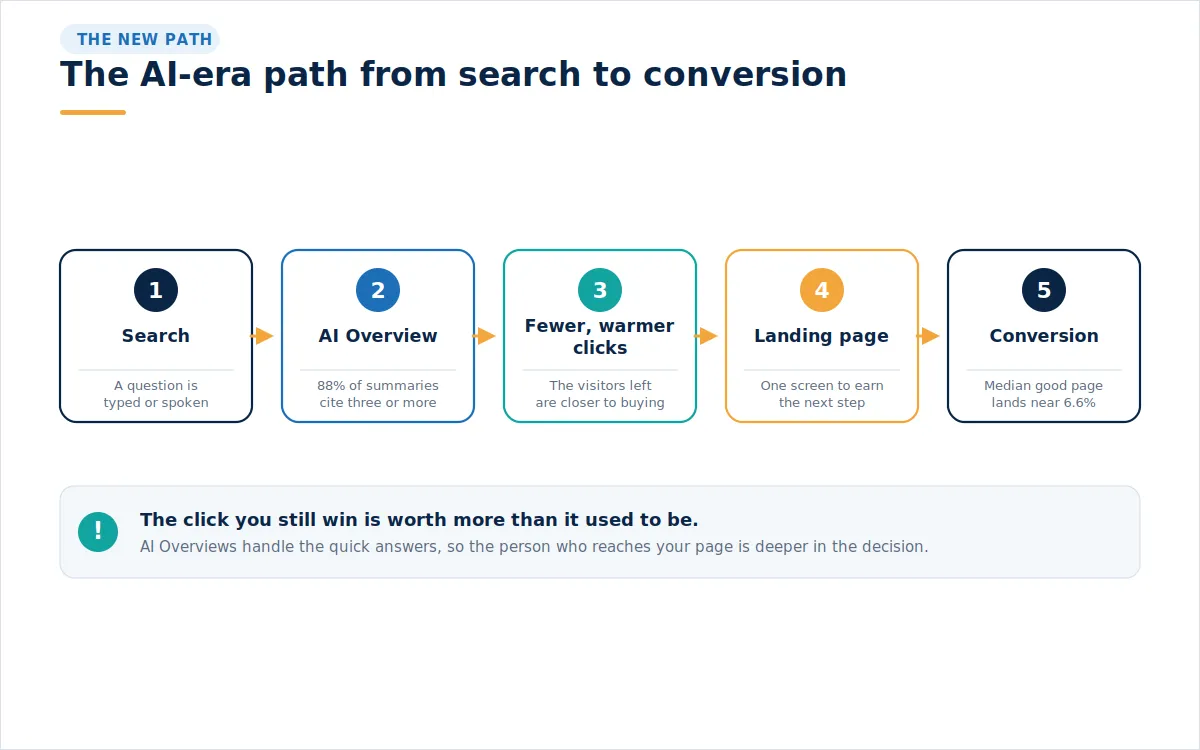
Two shifts are worth holding together. Traffic to informational pages is thinner, and the traffic that remains is warmer. Google's move toward AI Mode, where a question unfolds into a conversation, pushes this further. Its own leaders have said AI Mode queries take about 3 times as long as a standard search, which means people describe what they actually want in detail before they ever reach a site. By the time someone lands on your page from that kind of session, they have already narrowed their options.
This is why a strong page now carries more weight than a strong ranking alone. A result can sit at the top and still lose the visit inside a summary. The page that does earn the click has to convert at a higher rate to make up for the smaller pool. That pressure is the whole case for treating conversion rate optimization as a first-class channel rather than an afterthought once the traffic is booked.
There is a quieter cost as well. The same Pew data showed that people were more likely to end their session entirely after seeing an AI Overview, at 26 percent, compared with 16 percent without one. A slice of your former audience now gets what it needs and closes the tab. Chasing those readers with more of the same content rarely brings them back. Earning the visitors who remain, and doing it more efficiently, is the durable response.
Match The Promise That Brought Them #
Every visit starts with a promise. In paid search traffic, the promise is the ad. In organic, it is the title and snippet. In an AI answer, it is the sentence that named you. Message match is the practice of making the top of your page repeat that promise almost word for word. When the headline echoes the phrase that earned the click, the visitor relaxes, because the page has confirmed it understands why they came. When the headline talks about something else, they leave.
Write the headline around the outcome, not the feature. A person searching for a faster payroll run does not want to hear that your software has a scheduling module. They want to hear that payroll takes ten minutes on Friday. Benefit-first headlines are the least glamorous and most reliable lever in landing page optimization, and they cost nothing but the discipline to rewrite. Strong conversion-focused copy earns the scroll, and the rest of the page has to earn the click on your button.
A plain example makes the point. If your ad promises a free thirty-day trial with no card required, the first line of the page should say "free thirty-day trial, no card required," not a clever slogan about growth. The visitor is scanning for confirmation, and matching the wording gives it to them in a fraction of a second. This continuity, sometimes called scent, should run the whole way through the funnel, from the words in the answer to the words on the button they finally click.
Write For The Skim, Not The Read #
Almost no one reads a landing page from top to bottom. They skim, and they decide fast. Studies of on-page behavior put the window at a handful of seconds before a visitor judges whether a page is worth their time. That means the first screen has to carry the argument on its own. Lead with the outcome, support it with one line of context, and keep the primary action in view without a scroll.
Break the rest of the page into short blocks that each make a single point, so a skimming eye can catch the shape of the offer from the headings alone. White space is not wasted space; it gives the elements that matter room to be noticed. Quiet directional cues, a face looking toward the form or a line of motion, point the eye at the action you want. A good test is whether the page still makes sense when you read only its headings and its button.
Speed is The First Thing They Feel #
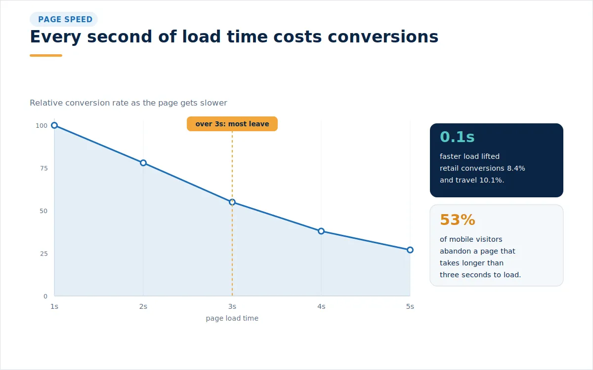
Before a visitor reads a word, they feel how fast the page arrived. Speed is not a technical nicety sitting off to the side of conversion. It is part of conversion. Google and Deloitte measured this across 37 brands and tens of millions of sessions, and found that an extra tenth of a second of speed increased conversions by 8.4 percent for retail sites and 10.1 percent for travel sites. A tenth of a second. At the other end, more than half of mobile visitors abandon a page that takes longer than three seconds to appear.
The practical targets are a fast Largest Contentful Paint, a layout that does not jump as images load, and a quick response to the first tap. Compress the hero image, defer scripts not needed for the first view, and be honest about how many third-party tags the page carries. Speed work compounds, because every visitor pays the tax and every improvement refunds it. Good landing page design treats performance as a design constraint, not a cleanup task for later. In practice, that means aiming for a Largest Contentful Paint under about two and a half seconds, a layout stable enough that nothing shifts under a thumb as it loads, and a page that responds the instant it is tapped. These are the Core Web Vitals signal grades, and they align almost exactly with how visitors feel.
The Anatomy of a Page Built to Convert #
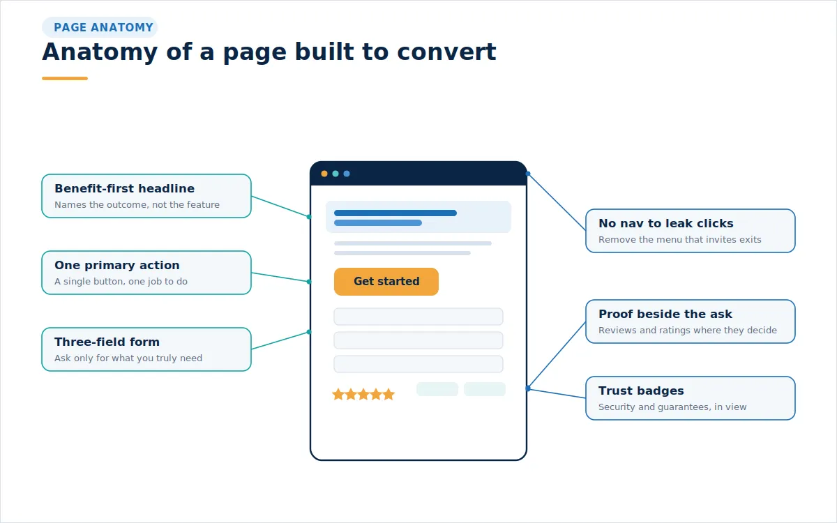
A landing page is not a home page. A home page invites exploration. A landing page removes it. The most reliable structure keeps a single goal in view and strips out anything that competes with it. That starts with the navigation menu. Removing the top nav so the only paths forward are the call to action or the back button sounds aggressive, and it works because every extra link is an invitation to wander off. One widely cited enrollment page test found that removing the navigation and putting the form front and center sharply increased conversions.
Below the headline, the page should read as a short argument. State the outcome, show the proof, name the offer, and ask once. Keep one primary call to action and repeat it as the person scrolls, rather than introducing competing buttons. Pages with a single focused action tend to outperform pages that ask for several things at once, because a visitor forced to choose between actions often chooses neither.
Forms Are Where Intent Meets Friction #
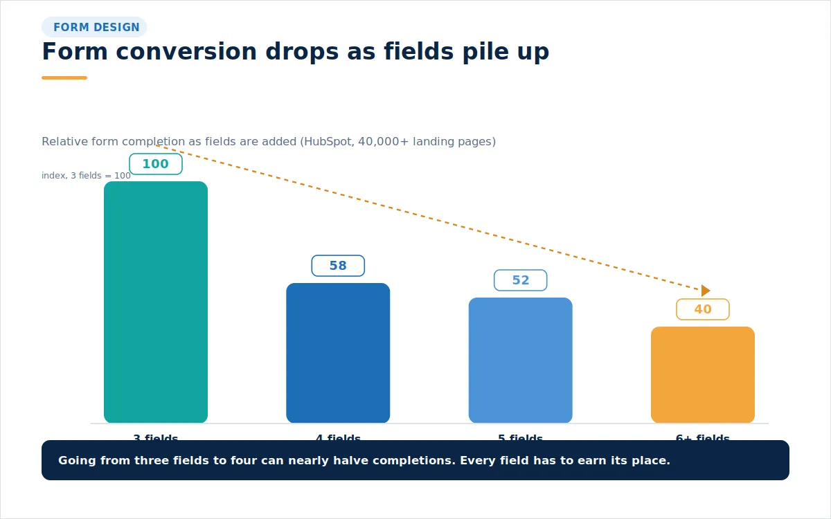
The form is the moment a visit turns into a lead or a sale, and it is where good intentions quietly leak away. Every field you add asks for more effort and more trust, and the trade is rarely worth it. A HubSpot analysis of tens of thousands of landing pages found that completion peaks around three fields and falls sharply when a fourth is added. The instinct to collect job title, company size, and budget up front feels responsible and usually costs more leads than the data is worth.
Ask for what you need to make the next contact useful, and gather the rest later. If a longer form is genuinely required, break it into steps so the person sees progress instead of a wall of boxes. Label each field plainly, explain why anything sensitive is needed, and never hide the submit button under a fold of fine print. The goal is not the shortest possible form. It is the shortest form that still qualifies the lead.
There is a twist worth knowing. Cutting fields is not always the win. In one well-documented test, removing fields actually lowered conversions, and the fix was not fewer boxes but clearer ones, with a short note beside each field explaining why the information was needed. That single change lifted completions without shortening the form. So treat a low field count as a strong default, not a law. Turn on browser autofill, offer a guest path before you ask anyone to create an account, and, where a form is long, use a multi-step layout with a visible progress bar to keep momentum alive.
Proof Does The Convincing #
People believe other people more than they believe you. That is why proof belongs next to the ask, not buried at the bottom. Ratings, short testimonials with a real name and role, recognizable logos, and a plain security or guarantee note all lower the risk of saying yes. Reviews carry particular weight because they answer the quiet question every visitor has: whether someone like them was glad they went ahead.
Place the proof where the decision happens. A testimonial beside the button works harder than a wall of praise the visitor has to scroll to find. Use photographs of real people rather than stock images whenever possible, since visitors tend to trust a real face over a polished placeholder. A short video testimonial can carry more conviction than the same words in text, because tone and expression are hard to fake. Keep the claims specific throughout. A number a customer can picture beats an adjective they will forget.
Know What Good Looks Like, Then Test Toward it #
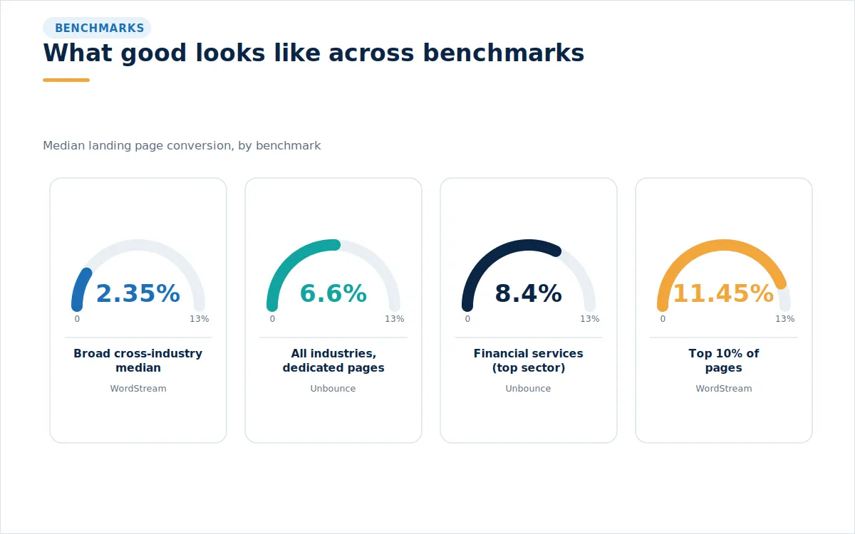
Benchmarks are useful for setting expectations and useless as a finish line. Across a large sample of dedicated landing pages, Unbounce reported a median conversion rate near 6.6 percent, with the strongest pages exceeding 11 percent. Broader cross-industry datasets from WordStream sit lower, with a median closer to 2.35 percent, because they mix all kinds of pages and traffic together. Financial services pages tend to run higher, near 8.4 percent, on the strength of clear intent. Your own number depends on your offer, your price, and where the traffic came from, so the honest comparison is against your past self.
The way you improve is by testing, and most teams do far less of it than they believe. When you test, change one thing with a clear reason behind it, give it enough traffic to matter, and measure the outcome that pays the bills rather than a click along the way. Headlines, the offer, the form, and the layout produce bigger swings than button colors, so start where the money is. Traffic from email nurture often converts several times better than cold traffic, so segment your results by source before you judge a page.
Cadence matters as much as method. Only a minority of teams test their pages regularly, which is exactly why steady testing pulls ahead. A page is never finished, only current. The teams that keep a small queue of experiments running tend to compound their gains quarter after quarter, while the ones who ship a page and walk away slowly fall behind their own benchmark.
The Agentic Shift is Already Moving The Finish Line #
The next change is bigger than a new box on the results page. Google is building toward agentic shopping, where discovery, comparison, and even checkout can happen inside its own surfaces. At the start of 2026, it introduced the Universal Commerce Protocol and a branded Business Agent, along with checkout inside AI Mode, so a person can research and buy without visiting a retailer's site at all. For ecommerce marketing, this moves part of the sale off your page and into a feed.
That does not retire the landing page. It splits its job. Structured product data, accurate pricing, and clean feeds decide whether an agent surfaces you at all, which is where getting cited in AI answers and disciplined AI search optimization begin to overlap with conversion work. The page still has to close the visitor who does arrive, and that visitor is more decided than ever. The two efforts feed each other. Be present in your answer and persuasive on the page.
The upside is real. Visitors arriving from AI assistants tend to convert at a high rate, with some reports putting it near 7 percent, several times what social traffic delivers, precisely because they arrive ready to act. When an agent hands off to your page, make sure your prices, offers, and any loyalty benefits are visible, because an agent that cannot read your incentive will compare on the one thing it can always see, which is price.
What To Do With All This #
The search page will keep changing, and the click will keep getting scarcer and warmer. The answer is not to chase volume that is no longer there. It is to make every arrival count, with a page that loads fast, says one true thing clearly, proves it, and asks once. That is landing page optimization in plain terms, and it is within reach of any team willing to test its way there. If you would like a second set of eyes on where your pages are losing visitors, our team is glad to take a look.
Frequently Asked Questions #
What is landing page optimization?
Landing page optimization is the practice of improving a single page so that more of its visitors take a specific intended action, such as making a purchase, signing up, or submitting an inquiry.
Why do landing pages matter more now that AI Overviews answer questions?
AI Overviews cut clicks but tend to send warmer visitors, so each arrival is worth more, and the page must convert at a higher rate to keep revenue steady.
What is a good landing page conversion rate?
Across dedicated landing pages, the median is near 6.6 percent, with strong pages above 11 percent, though a realistic target depends on your industry, offer, and traffic source.
How much does page speed affect conversions?
A great deal. A 0.1 second speed gain lifted retail conversions by about 8.4 percent in a Google and Deloitte study, and over half of mobile users leave pages that take more than three seconds.
How many form fields should a landing page have?
As few as the next step truly requires. Completion tends to peak around three fields and drops when a fourth is added, so collect extra detail later.
Should a landing page keep its navigation menu?
Usually no. Removing the top navigation keeps visitors focused on the single action and cuts the paths that lead them away from it.
What is message match?
Message match means the top of your page repeats the promise of the ad, link, or answer that brought the visitor, which reassures them they are in the right place.
Where should social proof go on a landing page?
Next to the call to action, where the decision happens. A testimonial or rating beside the button reduces hesitation better than proof buried lower down.
How do I properly test a landing page?
Change one meaningful element at a time, run it until you have enough traffic to trust the result, and measure the action that drives revenue rather than an early click.
How does Google's move to AI Mode and agentic checkout change landing pages?
It shifts discovery and some purchases into Google's own surfaces, so clean product data earns visibility while the page still has to convert the more decided visitor who arrives.
Written by